Business Card Design Mistakes
Business Card Design Tips
Business Card Design Mistakes to Avoid
Designing an effective Business Card
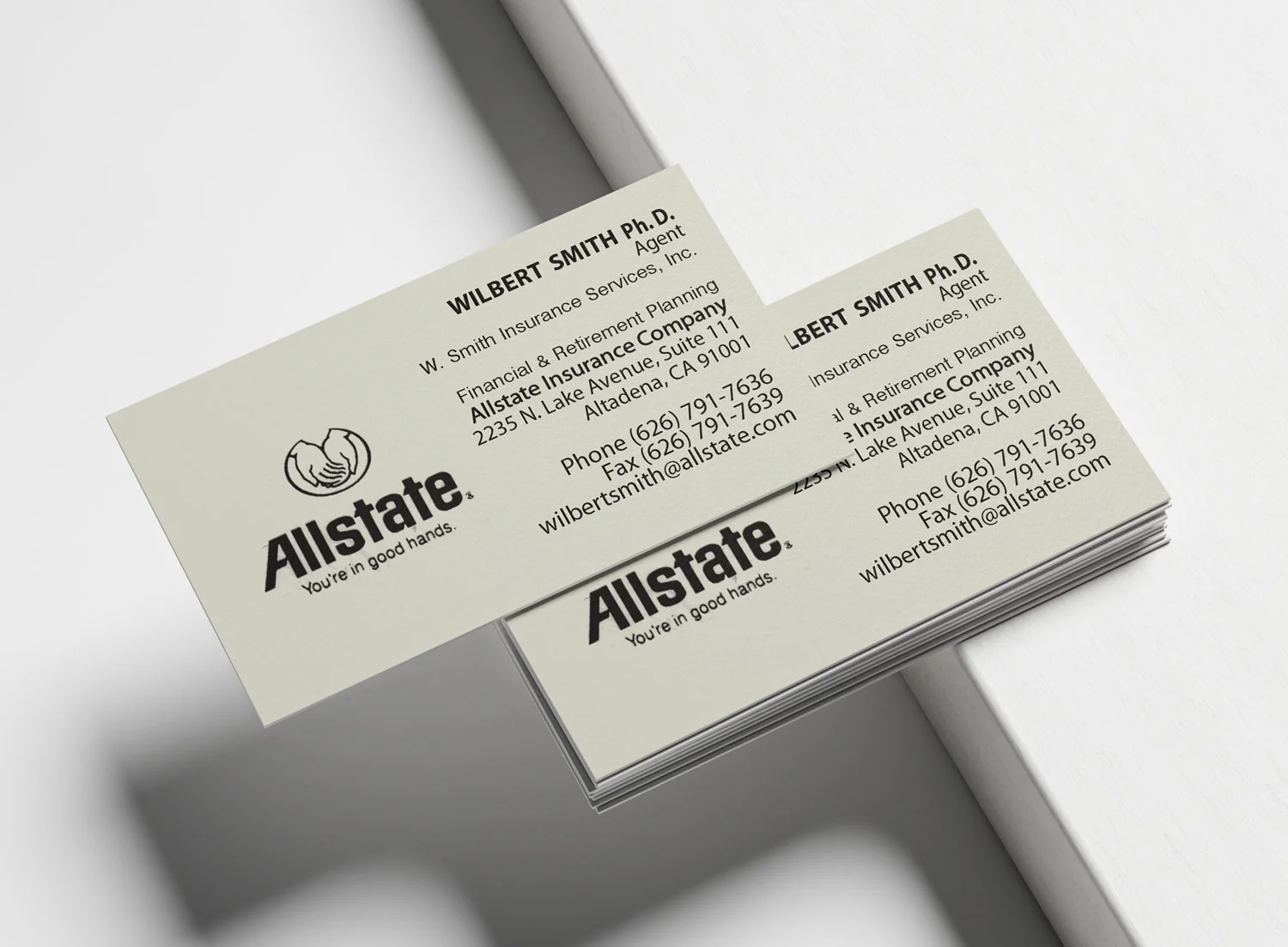
A well-designed business card can leave a lasting impression, while a poorly designed one may be overlooked or forgotten. Avoiding a few common design mistakes can make the difference between a business card that gets saved and one that ends up in the recycling bin.
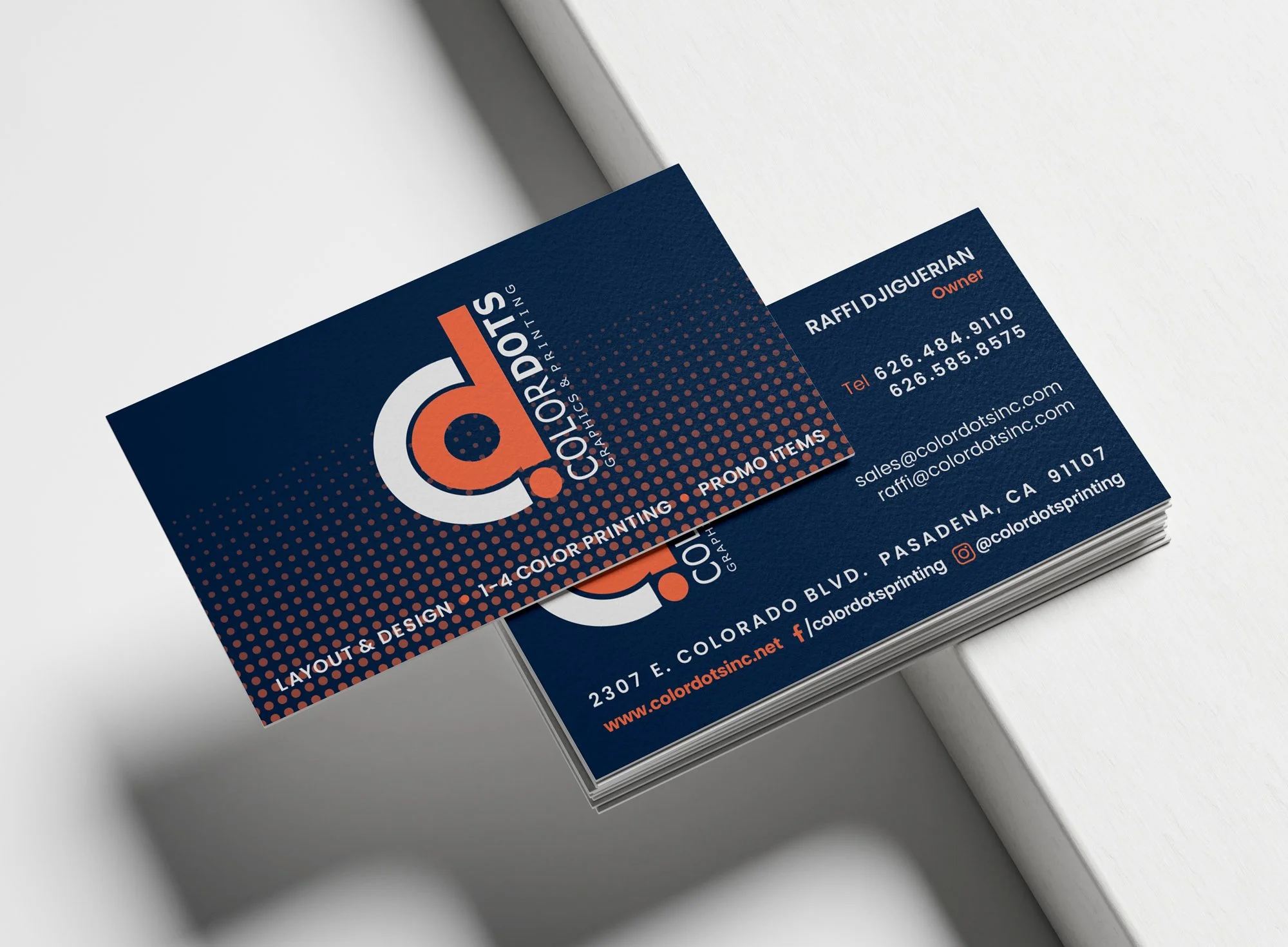
Clean Design
·
Professional Printing
·
Memorable Results
·
Clean Design · Professional Printing · Memorable Results ·
Communicate who you are
Your business card is often the first physical representation of your brand. A thoughtful design should communicate professionalism, reinforce your identity, and make it easy for people to remember and contact you. Here are a few of the most common mistakes to avoid.
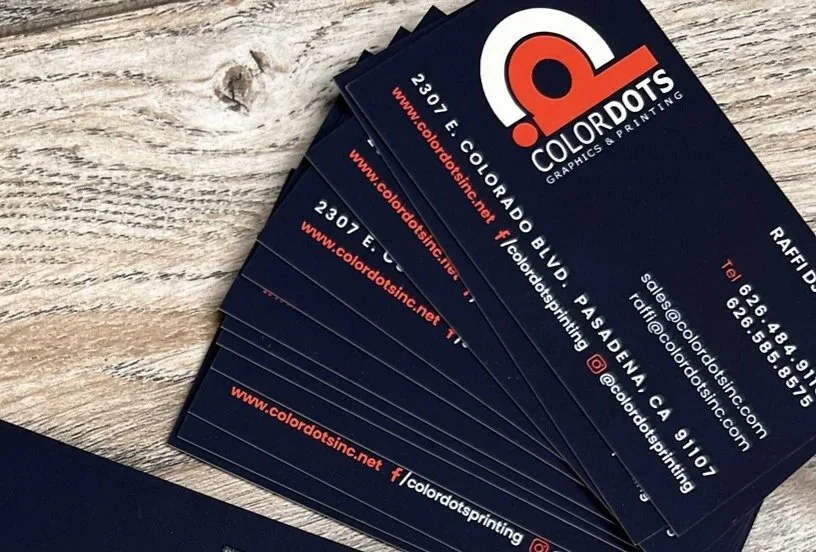
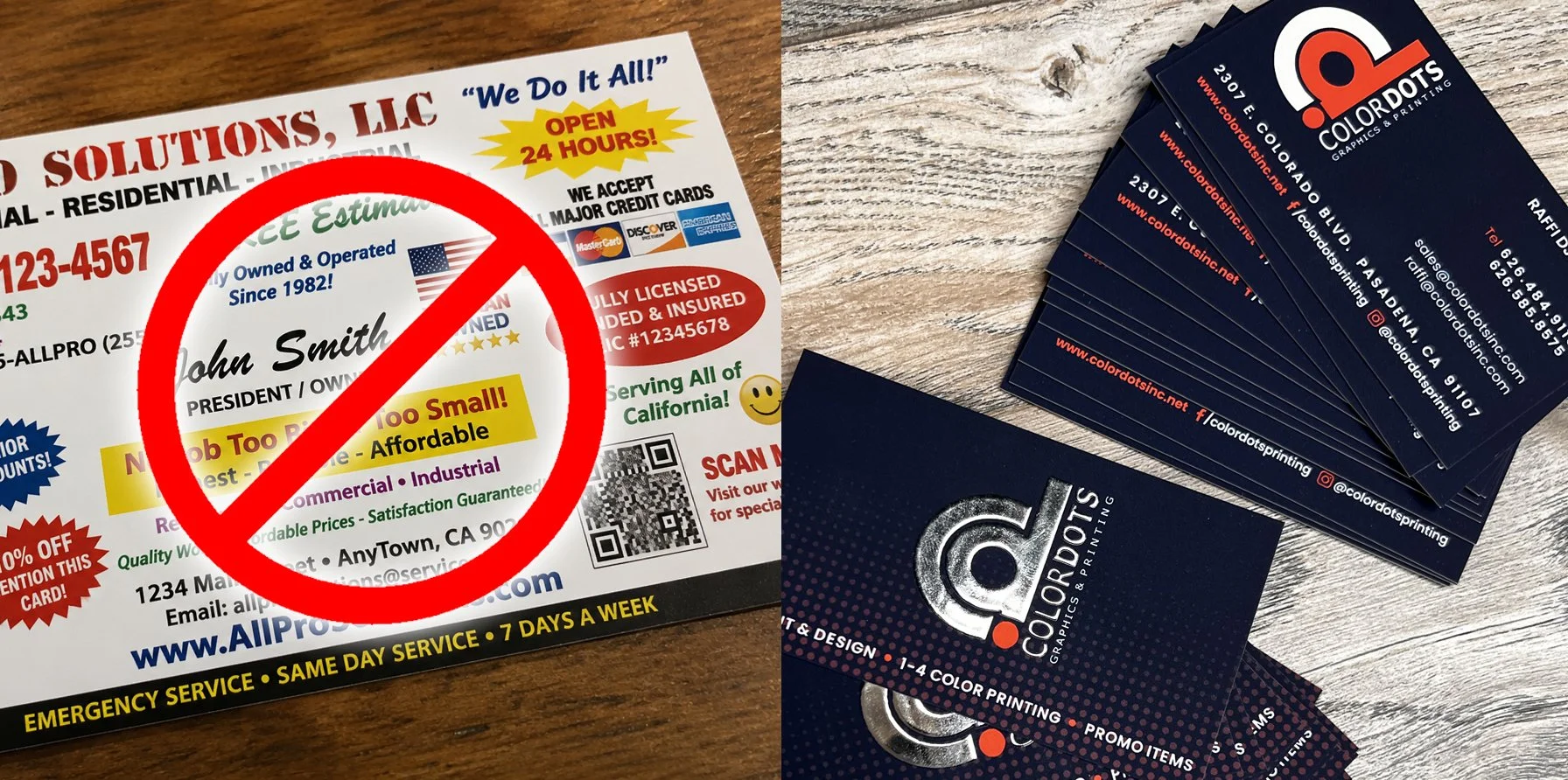
Common Design Mistakes
-
Too Much Information
Trying to include every detail about your business can quickly overwhelm the design. Focus on the most important contact information and keep the layout clean and easy to scan.
-
Poor Typography
Using too many fonts, text that's too small, or decorative typefaces can make your business card difficult to read. Choose clear, professional typography with a strong visual hierarchy.
-
Low-Quality Images
Blurry logos, low-resolution graphics, or poor-quality artwork can make even the best business appear unprofessional. Always use high-resolution files designed specifically for print.
-
Ignoring White Space
White space isn't wasted space—it's an essential design element. Giving text and graphics room to breathe creates a cleaner layout, improves readability, and helps draw attention to the most important information.